Managing Products
Create, configure, and manage custom print-on-demand products for your Shopify store.
Product Overview
Podmaster supports four main product creation paths, each suited to different use cases:
- Template Products — Products created from pre-designed templates with pre-configured print areas
- Store-Based Products — Existing Shopify products turned into customizable products through the create-product-from-store flow
- Scratch-Built Products — Products built from scratch with your own images and custom print area definitions
- Printful Catalog Products — Products sourced from the Printful catalog with automatic dropshipping fulfillment
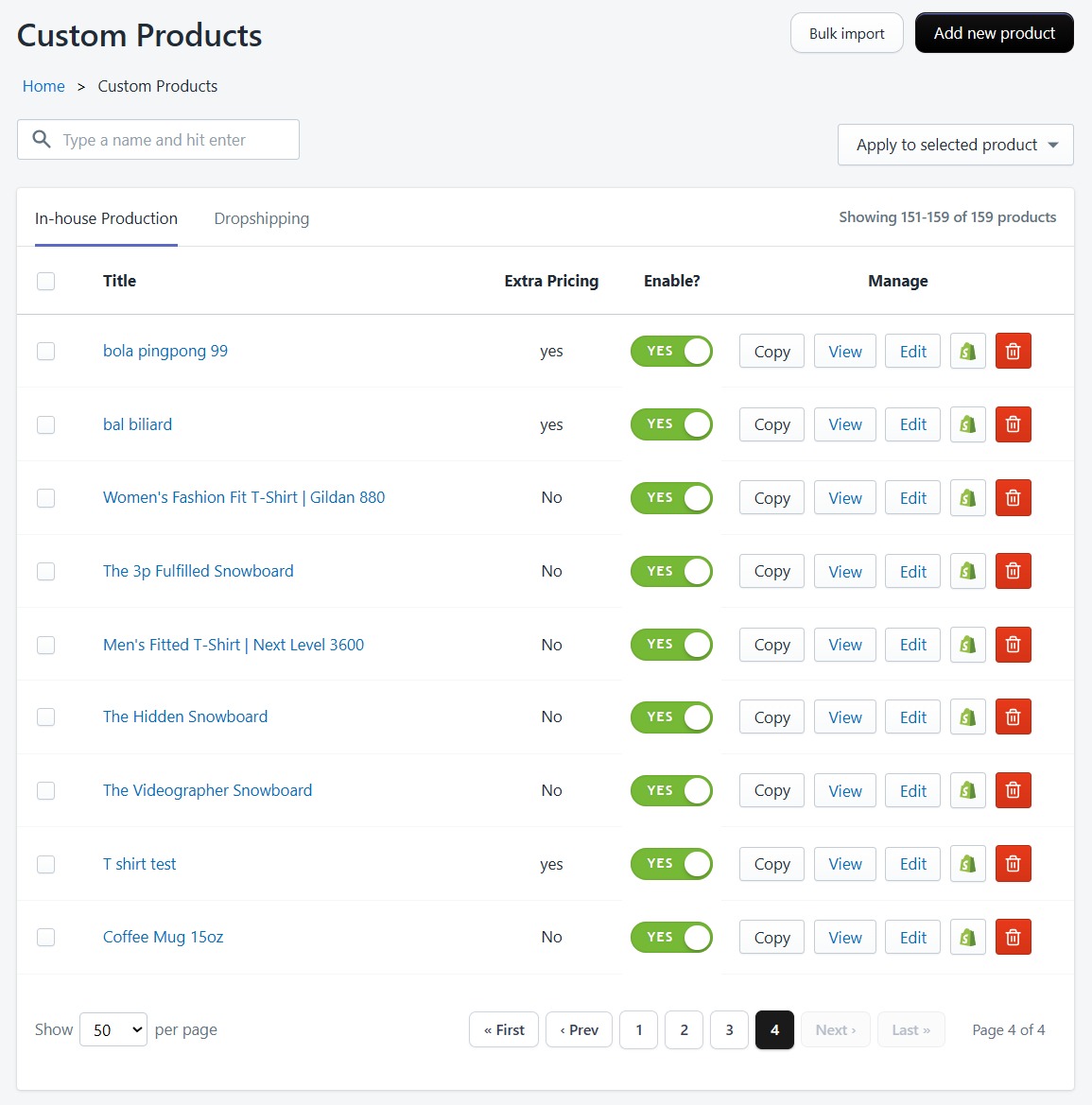
Product List
The Products page displays all your custom products with pagination (35 per page). You can:
- Search products by name
- Filter by product source (Shopify, Template, or Printful)
- Switch between Custom Products and Dropshipping Products tabs
- View product status (active or inactive)
- Edit or delete products
Creating Products
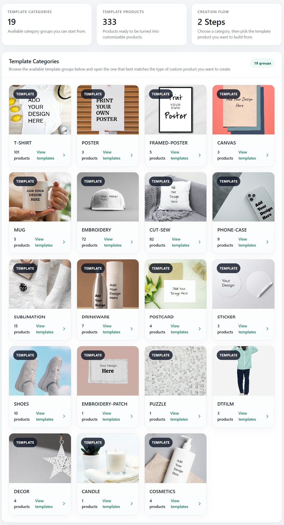
From Templates
Templates are pre-designed product configurations with print areas already defined. Choose a template category, pick a template, and customize the design. This is the fastest way to create products without manual configuration.
From Your Store (Existing Shopify Products)
Turn any existing product in your Shopify store into a customizable one. This is ideal when you already have products listed and want to add personalization without recreating them.
Requirements
- The product must have Size and Color options defined in Shopify
- The product must not already be customized through Podmaster
- Your plan's custom product limit must not be exceeded
Selecting a Product
- Go to Products → Select Products → From Store
- Browse product categories — the app automatically groups your store products by product type (e.g., T-Shirt, Mug, Poster)
- Click a category to see all products within it
- Use the search bar to find products by name, or click "Filter by size and color" to narrow results
- Hover over a product card and click "Select this"
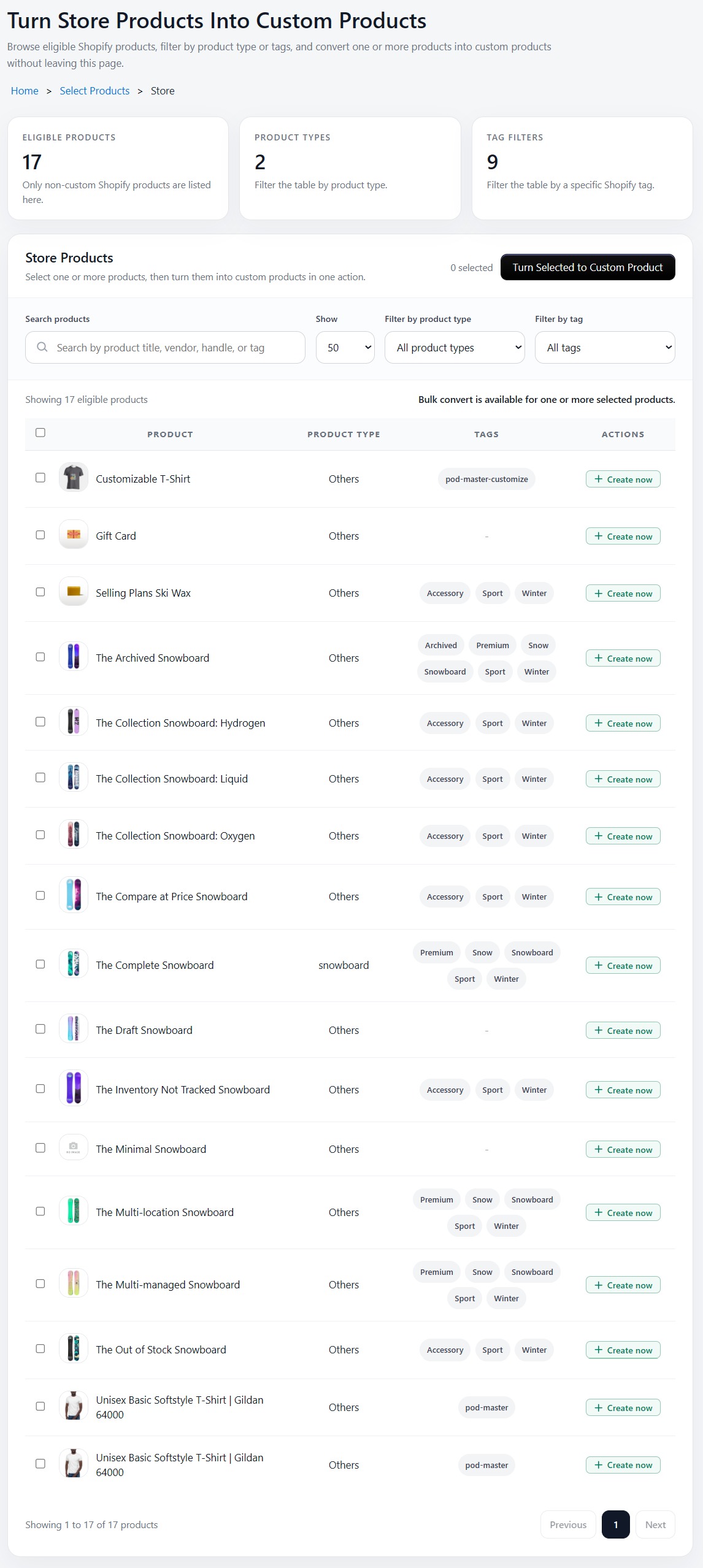
Products that have already been customized will show an "Already Added" badge and cannot be selected again.
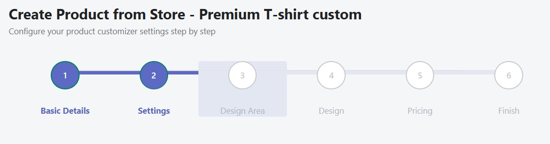
Step 1: Select Product Sides
Choose which sides of the product customers can customize. Select a pre-configured side set (e.g., "Front Only", "Front + Back", "All Sides") from the dropdown. Side sets are managed in the Asset Library.
Step 2: Side Configuration
Each product side has a card with the side name, image preview, and five configuration buttons. A green checkmark appears next to each button once that feature has been configured.
| Button | Description |
|---|---|
| Change Image | Replace the product side image with a new photo from your computer (PNG, JPG). This image represents how the product looks from that angle and is shown to customers in the customizer. |
| Setting | Configure the customization profile, font list, color lists (for text and images), and print profile for this side. These control what tools and options customers see in the storefront customizer. Use "Apply to All Sides" on the primary side to copy settings to all others. |
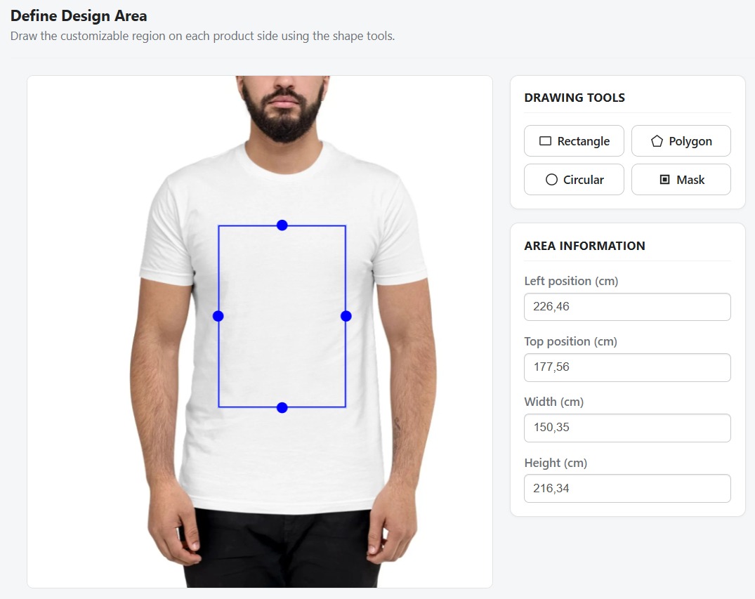
| Design Area | Draw the printable region on the product image using Rectangle, Polygon, Circle, or Mask tools. This defines where customers can place their designs. Fine-tune position and dimensions using numeric inputs (in cm). |
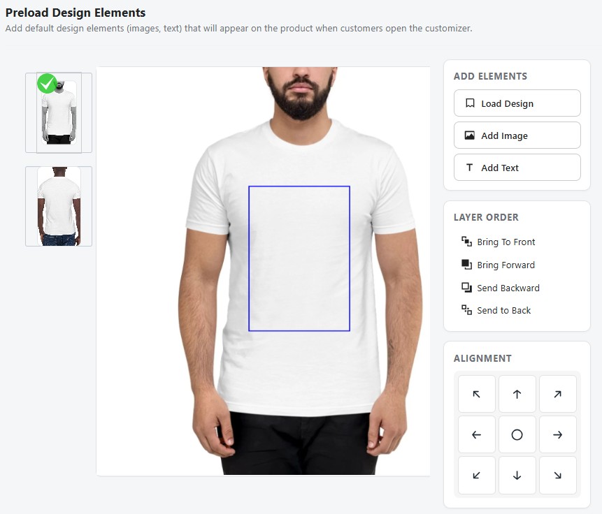
| Preload Design | Add default text or images to the canvas that customers see when they open the customizer. The design area boundary is shown as a guide so you can position elements precisely inside the printable region. Use the Clean Canvas button to remove all added elements. |
| Print Profile | Assign a print profile to this side to control paper size, margins, design placement, and color output (RGB/CMYK) when generating print-ready PDFs. See Print Profiles for setup. |
An information guide panel on the right side of the edit page explains each button's function for quick reference.
Step 3: Define Print Areas
Click Design Area on a side card to draw the printable regions using the built-in drawing tools:
- Rectangle Tool — Draw rectangular print areas (most common)
- Polygon Tool — Draw custom polygon shapes for irregular products
- Circle Tool — Draw circular or elliptical print areas
- Mask Tool — Upload an image to use as a custom boundary mask
Fine-tune position and dimensions using the numeric inputs (in cm). Switch between side tabs to define areas for each one.
Step 4: Add Default Designs (Optional)
Click Preload Design on a side card to pre-populate the canvas with default design elements:
- Load Design — Import a saved design template from your library
- Add Image — Upload images or clipart onto the canvas, automatically clipped to the design area
- Add Text — Place text elements using the first available font and color from the side's configured lists
- Clean Canvas — Remove all design objects while preserving the design area boundary
- Use arrangement buttons to layer elements (bring to front, send to back)
The design area boundary is displayed as a visual guide so elements are positioned within the printable region. Images and text are automatically clipped to stay inside this area.
This step is optional — skip it if you want customers to start with a blank canvas.
Step 5: Set Pricing (Optional)
Configure extra pricing rules for customization on top of your Shopify product prices:
| Pricing Rule | Description |
|---|---|
| No Extra | Use your existing Shopify variant prices as-is (default) |
| Fixed | Add a flat fee to every variant (e.g., +$5.00 for customization) |
| Percent | Add a percentage markup (e.g., +20% for customization) |
| Per Character | Charge per character of text added (e.g., $0.50/character) |
| Per Word | Charge per word of text added |
| Per Image | Charge per image/clipart added (e.g., $2.00/image) |
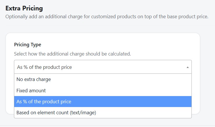
Pricing rules can be combined — for example, a fixed fee plus per-image charges.
Finishing Up
Click "Finish" to save the product. Podmaster will:
- Save all configuration (sides, print areas, designs, pricing) to the database
- Upload side images to secure S3 storage
- Tag the Shopify product with
pod-master-customize - Add a metafield linking the product to the customizer
- Redirect you to the Products list where the new customizable product appears
The product is now live — customers will see the "Customize" button on its product page.
From Scratch
For full control over every aspect, create a product entirely from scratch. This is similar to "From Store" but you also define the product itself (title, images, variants) rather than importing from an existing Shopify product. The same 5-step wizard applies:
- Upload custom product base images
- Configure side settings (fonts, colors, profiles)
- Define print areas using the drawing tools
- Add optional default designs
- Set pricing rules
From Printful Catalog
Browse the Printful product catalog organized by category: apparel, drinkware, accessories, home decor, posters, and more. For each product you can:
- View product details, available sizes, colors, and mockup images
- Select which variants to offer in your store
- Set your retail pricing (markup over Printful's base cost)
- Sync the product directly to your Shopify store
Printful catalog products require a connected Printful API key. Set this up in Settings → Printful.
Product Configuration
Each product has the following configurable properties:
| Setting | Description |
|---|---|
| Title & Description | Product name and description synced to Shopify |
| Sides/Variants | Define multiple product sides (front, back, left sleeve, right sleeve, etc.) |
| Print Areas | Draggable regions where customers can place designs on each side |
| Design Templates | Pre-assigned designs that load by default in the customizer |
| Pricing | Base price plus optional extra pricing rules for customization |
| Print Profile | Assign a print profile for physical printer output settings |
| Status | Active (visible in store) or Inactive (hidden) |
Defining Print Areas
Print areas determine where on the product customers can add their designs. For each product side, you can:
- Drag and resize the printable region over the product image
- Set minimum and maximum dimensions
- Configure the DPI and output resolution for print-ready files
Products must have at least one print area defined before customers can use the customizer on your storefront.
Variant Selector & Color Swatcher
The Variant Selector setting controls how product variants (typically colors) are displayed to customers inside the storefront customizer. Two display modes are available:
| Mode | How it looks | Best for |
|---|---|---|
| Select Box (default) | A standard HTML dropdown listing all variant values | Products with many variants, or when visual swatches are not needed |
| Image Swatcher | Clickable square swatches displayed in a row. Each swatch represents one color/variant. | Products with distinct color options where visual preview adds value |
Swatch Background Type
When Image Swatcher mode is selected, each swatch can show either a flat color or a product image as its background:
| Background Type | Description |
|---|---|
| Color | The swatch background is filled with the variant's color value (e.g., a red swatch for the "Red" variant). No image upload required. |
| Image | Each swatch displays a thumbnail of a product photo uploaded specifically for that variant color. A 5 px padding is applied so the image doesn't extend to the swatch border, giving a clean framed appearance. |
Uploading Variant Images
To use Image background type, you must upload a separate image for each color variant:
- On the product edit page, scroll to the Variant Images tab in the product configuration card
- Each row in the table represents one variant color option from your Shopify product
- Click "Upload Image" on a row to select a photo from your computer
- The image is automatically normalized before upload — any Shopify CDN size suffixes (e.g.,
_small,_medium,_1024x1024) and query strings are stripped so the full-resolution source image is always used - The uploaded thumbnail is saved to your S3 storage and linked to that color variant
Color key matching is case-insensitive. If a variant is named "Red" in Shopify and "red" in your image mapping, the swatch will still display correctly.
How Swatchers Appear on the Storefront
In the storefront customizer, when a customer selects a product variant:
- In Select Box mode — a standard dropdown renders at the top of the customizer panel
- In Image Swatcher mode — a row of clickable swatches renders instead. The currently selected swatch is highlighted with a green border. Clicking a different swatch:
- Switches the active variant (and its color)
- If the variant change involves a different product side template, loads the correct canvas template for that color
- If only the color changes (same template), the canvas update is skipped to keep the customer's existing design intact
Configuring Variant Selector on a Product
- Open a product from Products list and click Edit
- In the product settings card, find the Variant Selector section
- Choose Select Box or Image Swatcher from the selector type dropdown
- If using Image Swatcher, choose Color or Image as the background type
- If using Image background, upload a photo per color variant in the Variant Images tab
- Click Save Settings — the storefront customizer will immediately reflect the new display mode
Design Assignment
After configuring print areas, open the product in the design editor to:
- Add default design elements (text, images, clipart) that appear when customers open the customizer
- Generate product mockup images for your store listing
- Save the canvas state so designs persist across sessions
Product Status
Active products are visible in your Shopify store and customers can access the customizer. Inactive products are hidden from the storefront but preserved in Podmaster for future use. Toggle status from the product list or the product edit page.