Product Customizer
Everything your customers need to design their perfect product — right on your storefront.
The customizer is what your customers see and use. As a merchant, you control which tools are available, what fonts and colors are offered, and which areas of the product can be customized — all configured in the Products settings.
How It Works
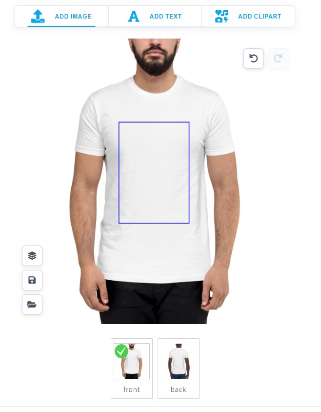
When a customer visits a product page on your store and clicks the "Customize" button, the Podmaster editor opens. They can add text, upload images, choose clipart, and see their design on the product in real time. When they're happy, they click "Add to Cart" — and the customized product (with a print-ready file) is automatically attached to the order.
Text Tool
Add names, quotes, or any custom text. Customers can choose font, size, color, and style.
Image Upload
Customers can upload their own photos or choose from your clipart and design library.
Colors & Styles
Pick colors from your predefined palette. Customers stay on-brand without feeling restricted.
Preload Designs
Start customers with a pre-made design template they can personalize, reducing blank-canvas anxiety.
The Customer Experience
Here's exactly what happens when a customer customizes a product:
Customer clicks "Customize" on the product page
The customizer editor opens. If you've set a preload design, it appears on the canvas automatically. Otherwise, the customer starts with a blank canvas.
Customer personalizes the product
They add text, upload images, choose colors, or apply clipart. They can see the changes live on the product mockup. For multi-sided products, they switch between tabs (e.g., Front / Back).
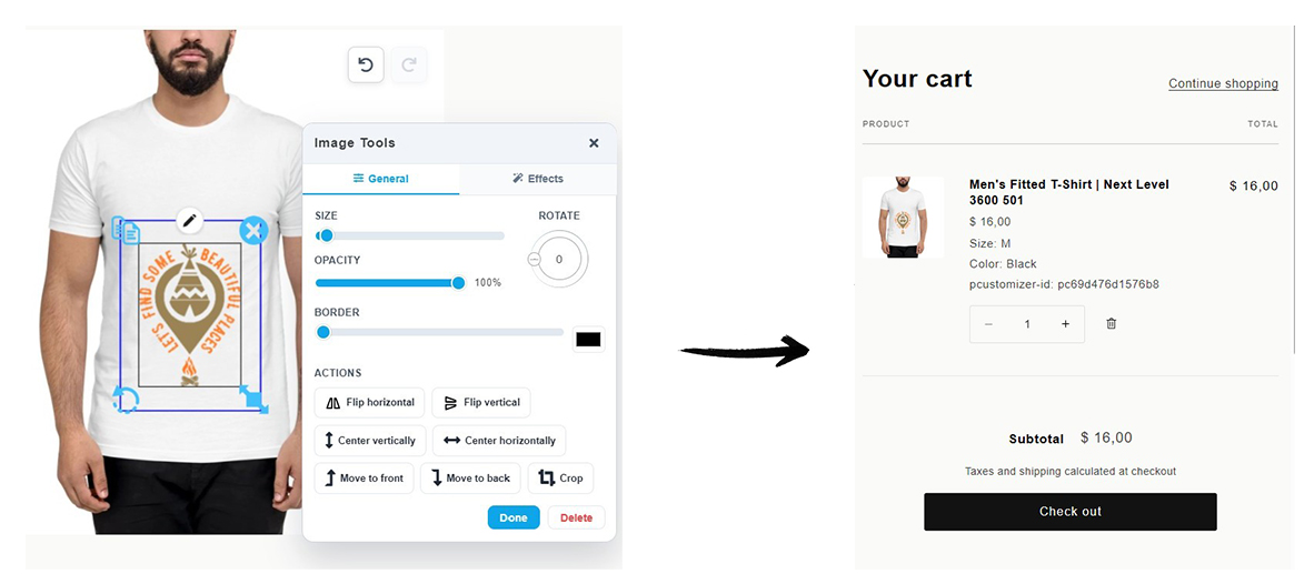
Customer clicks "Add to Cart"
Podmaster saves the design, generates a preview image for the cart, and creates a high-resolution print file. The product is added to the Shopify cart with the design attached.
Customer checks out normally
The checkout process is standard Shopify. Podmaster attaches the print-ready file to the order so you can access it from the Orders page when it's time to fulfill.
Editor Tools in Detail
Text Tool
Customers can add as many text elements as they like. Each text element supports:
- Font selection — Only fonts you've enabled in the Asset Library are shown
- Size, bold, italic, underline
- Color picker — Restricted to your approved color palette, or open picker if you allow it
- Curved text — Bend text along an arc (great for circular logos and badges)
- Drop shadow and opacity
- Free positioning — Drag, rotate, and resize within the print area boundary
Merchant tip: Add only the fonts that match your store's brand in the Asset Library. Too many font choices can overwhelm customers. 5–10 well-chosen fonts works best.
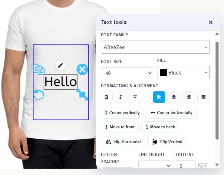
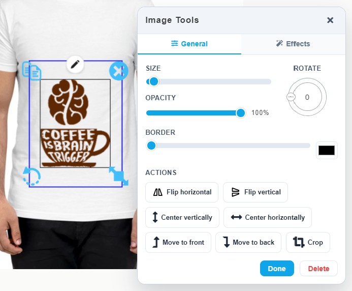
Image Tool
Customers can add images from several sources:
- Upload their own — PNG, JPG, SVG, or PDF. Recommended minimum 300 DPI for print quality.
- Your clipart library — Categories of clipart you've pre-loaded in the Asset Library
- Your design library — Full pre-made designs customers can apply and modify
- AI generated — If you've enabled an AI provider in Settings, customers can generate images with a text prompt
Once an image is added, customers can:
- Crop, rotate, scale, and flip it
- Remove the background (if AI background removal is enabled)
- Apply basic filters
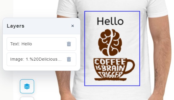
Layer Panel
Each element added to the canvas (text or image) appears as a layer. Customers can:
- Select any layer to edit it
- Reorder layers (drag to bring an element in front of or behind others)
- Lock a layer to prevent accidental changes
- Show or hide a layer
- Delete a layer
Multi-Side Products
If your product has multiple sides (e.g., Front and Back of a t-shirt), the editor shows a tab for each side. Customers can switch between them and add different designs to each side. Each side has its own independent canvas and print area.
You control which sides are shown and their print areas when you configure the product.
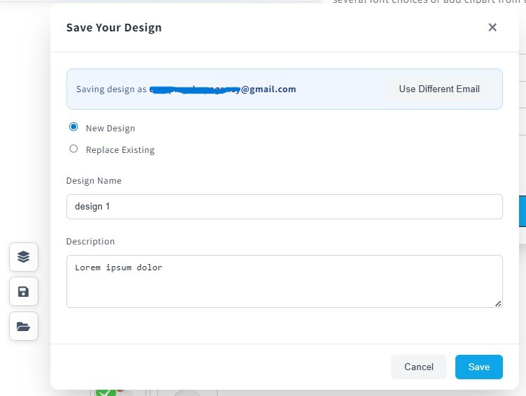
Saving & Sharing Designs
Save for Later
Customers can save an in-progress design to their account. The next time they open the same product, they can load the saved design and continue editing. This is useful for designs that take multiple sessions to complete.
Share a Design
A customer can generate a shareable link to their design. Anyone with the link can open the customizer pre-loaded with that design — great for ordering matching items for a group, or sharing with a friend for feedback.
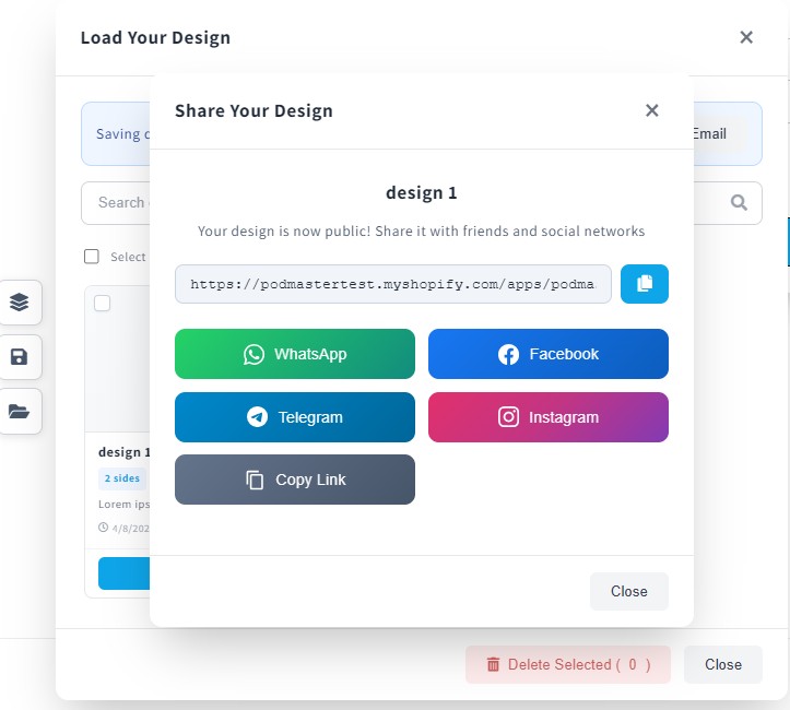
Guest customers (not logged in) receive a verification code by email to access their saved designs. Make sure your SMTP settings are configured in Settings → Email so these emails are delivered reliably.
What You Control as a Merchant
You configure what customers can and can't do — all in Products → Edit → Setting for each product side:
| Setting | What it controls |
|---|---|
| Personalization Rules | Which tools are shown to the customer (text, image, color, etc.) |
| Fonts | Which fonts customers can choose from |
| Colors | Approved color swatches for text and image elements |
| Print Area | The boundary customers can place designs within (maps to your printable area) |
| Preload Design | A design shown by default when the editor opens — customers can modify it |
| Print Profile | Controls how the print-ready file is generated (paper size, DPI, CMYK) |
Common Issues
"Customize" button not showing on the product page
- Make sure the product is configured in Podmaster (not just Shopify)
- Re-run the installation wizard in the app
- Some third-party themes need manual embed code — contact support if auto-install fails
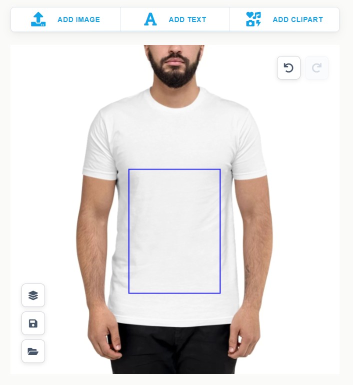
The print area boundary isn't where I expect it
- Open the product in Podmaster → Edit → Design Area and drag the print area box to match your product mockup image
- Make sure your product mockup image matches the dimensions of the actual product
Customer designs look pixelated when printed
- Ask customers to upload images at least 300 DPI at print size
- If using AI-generated images, note that they may not always be high enough resolution for large prints
- SVG files scale perfectly — encourage SVG uploads for logo-style designs